List Functionality
Desktop mode required: most of the features described on this page — tagging, flags, snapshots, advanced filtering, grouping, the summary line, exporting and charting — are only available in desktop mode. In the default responsive interface, list grids offer column sorting, a filter row and record navigation. To switch modes, click your username in the top right hand corner and choose Switch Mode — see Switching Interfaces.

To gain a little more room to visualise your data, you can click on the Expand/Shrink Menu button
to minimise the side-menu.
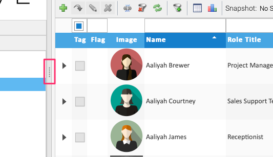
Clicking the button will restore the menu. You can also click and drag the button to make the menu wider or narrower without collapsing it fully.
Filter Line

The filter line provides the ability to quickly and easily filter the records in a list.
Each column uses a fixed filter operator suited to its type (e.g. a contains match for text
columns) — to choose a different operator, use the advanced filter.
Multiple columns can have filters applied which
will and their results together (i.e. it must match all filters, not any of).

To apply a filter, press Enter on your keyboard while typing in the filter line, or click the
Filter button on the end of the filter line.
Reset filters

Any applied filters can be reset by clicking the Clear filter criteria button from the
list tools. This will reset the list to it’s unfiltered state. Any applied grouping and
sorting will still be applied.
Column Headings

Column headings control sorting, you can do simple sorting by clicking on the column heading. Clicking once will sort the list by ascending order, each following click will then toggle between descending and ascending.
Clicking the dropdown or right-clicking a column heading exposes the column menu,
which allows you to Sort Ascending, Sort Descending, Configure Sort, Auto Fit the column
or Auto Fit all columns. You can also choose which columns you wish to see using the Columns function,
and Group by the column selected.
If you wish to no longer have the list sorted, you can return the list to the default configuration by clicking on the menu item on the left hand side that you clicked to get to your current screen.
Column Menu
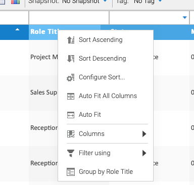
The column menu is available by right-clicking on a column heading. This will provide advanced options for sorting, grouping, resizing and showing/hiding columns.
Auto Fit
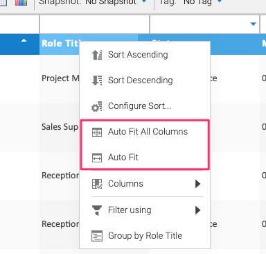
By clicking Auto Fit, the selected column width will automatically resize to show all
information in that column.
To resize all columns, click the Auto Fit All Columns button.
Configure Sort
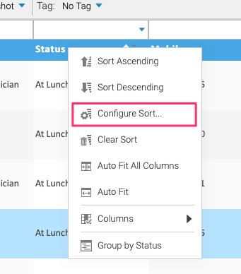
To use a more complex sort, you can use the Configure Sort tool. Right-click on any column
to bring up the column menu, then select the Configure Sort button.
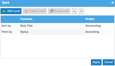
The Sort dialog will appear and you will now have the option to choose any number of ways to sort.
You can add and remove levels of sort or rearrange them if you wish. Click Apply to apply the
sort configuration to your list.
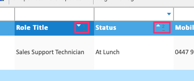
Your configured sort will show a superscript number representing its priority in your sort, and the arrow will indicate whether the data is ascending or descending.
Group by Column
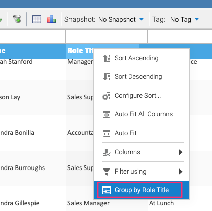
Data in a list can be grouped, e.g. by a status column. To group columns in a list, right-click on the column heading, e.g. “Role Title” in this example, to group all the staff in this list by their role title.
Below is an example of a list with grouping applied:
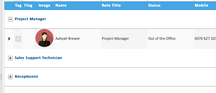
To remove the grouping, right-click a column heading again and choose Ungroup.
Show/Hide Columns
Sometimes lists can include additional columns which are not shown by default, or you may
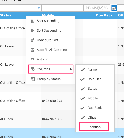
want to hide some columns. To modify which columns are shown, right-click anywhere on the column
header row and hover over Columns, then click on the column names to show or hide. A column with
a tick will be visible in the list, a column without a tick will not be shown.
To save a particular combination of columns, see Snapshots.
List Tools

The list toolbar provides a variety of basic and more complex functions for manipulating and working with
lists in Skyve in desktop mode. Alongside the tools described below, the toolbar always provides
record controls (New, Zoom, Popout, Edit and Delete), Deselect all, Clear filter criteria
and Refresh table data.
Most of these functions are also available by right-clicking a row in the list, which opens a
context menu with New, Zoom, Popout, Edit, Delete, Deselect, Clear Filter, Refresh,
Export Data... and Chart Data....
Advanced Filtering
The filter line can be used to provide simple filtering, but if you require more complex filter criteria, the advanced filter can be used.

Clicking the Use Advanced Filtering displays the Advanced Filtering
section above the list. There are three styles of Advanced Filter: Flat, Nested
and Inline. Each perform the same function, but you may find one style easier to use
than the others. Click the Add button to add additional critera to filter by, then
select the filter operator and enter the data you wish to find.
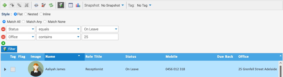
The advanced filter can also filter on the Tag and Flag fields — for example, add a criterion
on Tag equals true to reduce the list to only the records in the currently selected
tag.
Export Data
A key feature of List Grids is the ability to easily export data in a variety of formats out of Skyve applications.

To Export Data, click on the Export table data button from the list toolbar.
The key areas of the export data options are:
| Report Option | Description |
|---|---|
| report format | Allows you to pick the export file type, e.g. CSV, XLSX, PDF, DOCX. The available formats are configured per application. |
| page format | Allows you to configure the page size and orientation. |
| margins | Specify any margins for the report. |
| columns | This allows you to choose which columns from the list should be included in the export. By default, columns that are visible in the list will be exported (right-hand side). All columns, including those not shown are available for export. |
After clicking Generate, your file will be generated and will appear in your downloads. To change the data
shown in the export file, drag and drop between the two columns. If the report is formatted, you can change
the widths on the right hand side of the column selector.
Any simple or complex filtering applied to the list will still be applied when the data is exported. This allows a specific subset of data to be exported. Combining this with a Snapshot can allow exports to be consistently produced as an ad-hoc report.
When exporting a large list, you will be asked to confirm before proceeding — exports over a thousand rows may take a few seconds, and exports over ten thousand rows can take more than a minute.
Chart Data
List grids in Skyve desktop mode are excellent for ad-hoc reporting. Whether using complex filtering, summary functions or exporting your data to continue in Excel, R or other applications to continue working with your data. Another option List grids provide is charting your data.

To Chart Data, click on the Chart this data button from the list toolbar.
The key areas of the chart options are:
| Chart Option | Description |
|---|---|
| chart type | the type of chart to generate — line, line area, bar, horizontal bar, radar, pie, doughnut or polar area |
| chart title | an optional title displayed on the generated chart |
| category field | selects which field is used to categorise the data |
| category bucket | groups category values into buckets, e.g. numeric ranges, starts-with, or temporal buckets such as year or month |
| value field | selects which field values are displayed in the chart |
| value function | can be used to produce a numeric value for non-numeric fields, e.g. a count, or to sum numeric data |
| top N | limits the chart to the top N categories (by category or value, ascending or descending), optionally combining the rest into an “Others” category |
| order | controls the ordering of the chart’s categories |
Click Generate to produce the chart and visualise your data.
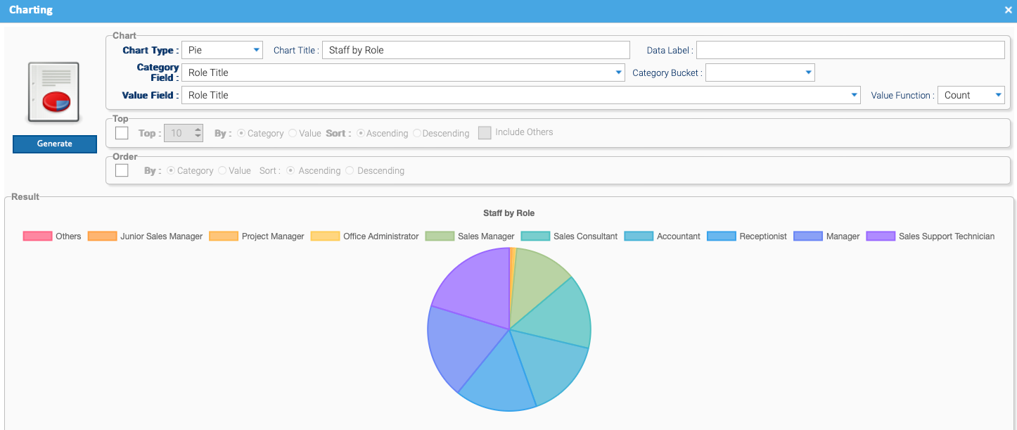
As when exporting your data, any filters applied to the list will be applied when charting your data.
Snapshots
Snapshots allow you to save customisations to a list grid, such as advanced filters, custom sorting or column configuration. See Snapshots.
Tags
Tags allow you to filter and store the selection of records within a Skyve list, or across multiple lists. See Tags for a more detailed explanation.
Flags
Flags are a useful tool for setting reminders or alerting others of something of
note. To set a flag, click in the Flag column next to the record, then enter
the text you wish to show and click Flag. The flag editor supports rich text, up to
1024 characters. The flag icon will show in the list and
when hovered over will display the message stored. To clear the flag, click the flag
and click Clear. If you wish to search by contents in a flag, they can be filtered
just like any other field.
Note: flagging is a permission — if your user has not been granted access to flags, the
Flag column will not be shown.
Summary Line

The Summary Line appears at the bottom of the list grid. The summary control in the left corner can be applied to enact a number of summary functions on the data.
There are functions to find the Count of the data, the average, the minimum and maximum,
and the sum of any field.
The selected summary function is saved as part of a Snapshot, so a list can be restored complete with its summary.