Views, widgets and layout
Views
View declaration files override the default detail view (generated by Skyve).
View files are located within the views folder in the document package. Typically, users interact with a detail view after zooming into the document from a list.

Two types of views can be declared for each document, and views can contain combinations of view components.
| View | Description |
|---|---|
| edit.xml | The basic view declaration for detail editing of a bean (normally accessed by zooming into a row from a list). Menu items can also target edit views directly. In this case the menu item will trigger newInstance() and a new document instance will be returned (and therefore displayed). To show a singleton (a document instance which is the only applicable existing instance within the context), the newInstance() method can be overridden to select and return an existing bean in place of the newly created instance.If a create.xml is supplied, the edit.xml file is only used after the document is created. |
| create.xml | Optional initial creation view. If a create.xml exists and the current bean has NOT yet satisfied the created condition (e.g. it has not been persisted), Skyve renders create.xml instead of edit.xml. After the bean is saved and the created condition evaluates to true (commonly via an expression such as isPersisted()), subsequent opens display edit.xml. See the “Create vs Edit view selection” section below for full lifecycle details and an example condition. |
Create vs Edit view selection
When both create.xml and edit.xml are supplied for a document, Skyve decides which view to render based on the value of the special created condition at runtime.
Lifecycle summary:
- A new instance constructed (e.g. via
newInstance()or implicit New action) ->createdcondition is evaluated. - If
createdis false, andcreate.xmlexists, Skyve renderscreate.xml. - User enters data and saves -> the instance is persisted.
- On the next render (or immediate rerender post-save),
createdis re-evaluated. Once it evaluates to true,edit.xmlis used from then on.
Typical created condition
Most documents implement the created condition using the persistence state of the bean. For example, the Admin module User document defines:
<condition name="created">
	<description>True when this User has been created</description>
	<expression>isPersisted()</expression>
</condition>
Key points:
isPersisted()(available in the expression context) returns true once the bean has been saved (has a primary key/bizId in the database).- If you do not provide
create.xml, Skyve always rendersedit.xmlregardless of thecreatedcondition. - If you provide
create.xmlbut omit acreatedcondition, Skyve will only render the document’sedit.xml. - You can tailor the
createdcondition to switch to the edit view only after some additional business rule (e.g. required related entities) is satisfied, not strictly the first persistence.
Use cases for create.xml:
- Simplified first-step data capture before exposing a complex full edit layout.
- Collecting minimal required attributes to establish identity, after which additional tabs/containers appear in
edit.xml. - Providing a focused onboarding experience (e.g. a wizard) distinct from later maintenance screens.
View declaration attributes
| Attribute | Description |
|---|---|
| name (required) | the name of the view - usually edit or create, or for a view component, the name of the component |
| title (required) | the title shown in the view title bar - this can be a binding expression including/or static text, e.g. “Details of Transaction {transactionId}” |
| helpRelativeFileName,helpURL | the location for help resources, e.g. “https://skyvers.github.io/skyve-dev-guide/views/” |
| icon32x32RelativeFileName, iconStyleClass | allows overriding of the icon displayed in the view title bar (by default this will be the icon associated with the document for which the view is declared), e.g. “fa fa-car” |
| refreshAction, refreshIf, refreshTimeInSeconds | allows control over automatic or conditional refresh of the view |
| xsi:schemaLocation (required) | the relative location of the Skyve view schema information (for validation of the view in the developer environment) |
| xmlns, xmlns:xsi (required) | name-space |
Online help resources
In desktop rendering mode (the SmartClient renderer), the application tool bar provides a Help icon button. To provide context-sensitive help, the view can declare helpRelativeFileName or helpURL locations for view-specific help information.
Don’t forget, that you can also provide attribute level help using the <description> attribute metadata.
Containers
Containers are layout devices which contain other elements.
Containers share basic properties:
| Property | Description |
|---|---|
| invisible | Whether the container (and contents) are invisible to the user. Invisibility may be set to true, false or the result of a declared condition. |
| percentageHeight | Percentage of the vertical visible area over which the container (and contents) will be stretched. |
| percentageWidth | Percentage of the horizontal visible area over which the container (and contents) will be stretched. |
| pixelWidth | Width of the container in pixels. |
| pixelHeight | Height of the container in pixels. |
| responsiveWidth | How many columns the container will span in responsive mode. Maximum value is 12. |
Container properties
Skyve Responsive mode (PrimeFaces) uses a 12 column grid to perform the responsive layout, as is common with many other front end CSS frameworks. To specify the number of columns to use, Skyve exposes a responsiveWidth. If a view specifies a responsive and a percentage width, responsive width will take priority in responsive mode.
Desktop mode (SmartClient) can use a percentage or absolute pixel width for layout. It does not have any concept of a 12 column grid, if a responsive width is specified, it will be converted to a percentage. If a view specifies a responsive and a percentage width, percentage width will take priority in desktop mode.
If you view has specified both, you will see different behaviour in the different modes, for example:
<form responsiveWidth="12" percentageWidth="60" border="true">
In responsive mode, a responsive width of 12 will span the width of the entire container it is in (equivalent 100%). However, when you switch this to desktop mode, this will only use 60% of the available container width.
Autofit behaviour
Rendering behaviour is specific to browsers, however Skyve will attempt to render the view as declared. Unless pixel sizes are specified, Skyve will stretch view elements to cover the available window size, according to the proportions and layout properties defined in the view.
Where the absolute size of the view exceeds the window space available, the view will render with scroll bars. Containers may overflow if the view definition doesn’t adequately take account of the number and nature of items contained.
| Container | Description | Specific properties | Example |
| hbox | Elements are laid out horizontally in the view and may contain other containers. |
| 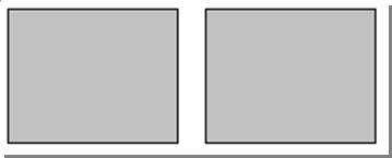 |
| vbox | Elements are laid out vertically in the view and may contain other containers. |
| 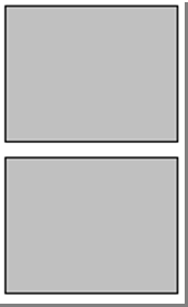 |
| tabPane, tab | A tab pane contains tabs. Tabs may contain other containers. |
|  |
View containers
Containers Example #1 - Two side by side vboxes

The above Container Layout is achieved through a pair of vboxes inside a hbox:
<hbox>
	<vbox>
		<form>
			<column/>
			<row>
				<item>
					<default binding="text1"/>
				</item>
			</row>
			<row>
				<item>
					<default binding="date1"/>
				</item>
			</row>
			<row>
				<item>
					<default binding="boolean1"/>
				</item>
			</row>
			<row>
				<item>
					<default binding="time1"/>
				</item>
			</row>
		</form>
	</vbox>
	<vbox>
		<form>
			<column/>
			<row>
				<item>
					<default binding="text2"/>
				</item>
			</row>
			<row>
				<item>
					<default binding="date2"/>
				</item>
			</row>
			<row>
				<item>
					<default binding="time2"/>
				</item>
			</row>
			<row>
				<item>
					<default binding="dateTime1"/>
				</item>
			</row>
		</form>
	</vbox>
</hbox>
In the above example, a single hbox is declared, two vboxes are then declared inside the hbox mentioned. A form with items is then placed inside each vbox.

Borders and Border Titles on the forms can help further separate and distinguish each form:
<!-- first form (left vbox) -->
<form border="true" borderTitle="Left vbox">

<!-- second form (right vbox) -->
<form border="true" borderTitle="Right vbox">
These borders and titles produce the following view:

If decided that the labels should be aligned differently, the alignLabel option
allows for different label positions:
<row>
	<item labelAlign="left">
		<default binding="text2"/>
	</item>
</row>
<row>
	<item labelAlign="centre">
		<default binding="date2"/>
	</item>
</row>
<row>
	<item>
		<default binding="time2"/>
	</item>
</row>
<row>
	<item>
		<default binding="dateTime1"/>
	</item>
</row>
These label alignments will change the position of the labels as such:

If ‘Text field 2’ and ‘Date field 2’ are required, we can make them required one of
two ways. As Text field 2 is always required, we can make it required within the
<DocumentName>.xml file like so:
<text name="text2" required="true">
	<displayName>Text field 2</displayName>
	<description>This is our second text field</description>
  	<length>20</length>
</text>
And as ‘Date field 2’ is only required when being used in this view, we can make it required within the edit view as shown:
<item required="true">
	<default binding="date2"/>
</item>
If we decide that ‘Time field 2’ should be renamed, we can change the Display Name
inside <DocumentName>.xml, or we can use a label inside the ‘time2’ binding within the edit
view this like:
<item label="SECOND TIME FIELD">
	<default binding="time2"/>
</item>
These recent changes have altered the edit view like so:

Containers Example #2 - Two side by side vboxes and one hbox underneath

The above Container Layout is acheived through a pair of vboxes inside a hbox, a second hbox is then added beneath to make room for a third form:
<hbox>
	Top two vboxes in here
</hbox>
<hbox>
	<form border="true" borderTitle="Third form">
		<column responsiveWidth="2"/>
		<column responsiveWidth="4"/>
		<column responsiveWidth="2"/>
		<column responsiveWidth="4"/>
		<row>
			<item>
				<default binding="text3"/>
			</item>
			<item>
				<default binding="boolean2"/>
			</item>
		</row>
		<row>
			<item>
				<default binding="time3"/>
			</item>
			<item>
				<default binding="dateTime2"/>
			</item>
		</row>
	</form>
</hbox>
The first hbox is declared, two vboxes are then declared inside the hbox mentioned. A form with items is then placed inside each vbox. A second hbox is then added (this hbox could be skipped and a form could be placed directly after the top hbox as the view would not change) with a form inside to create the necessary view.
Multiple items in a row can be seen in this last form, each item takes up two columns; one for the Display Name, and one for the field
These changes come together to edit the view like so:

If we want a new field called ‘Date/time field 2’ and for it to only be seen when ‘Second time field’ from the Right vbox is populated, we can use visibility on ‘Date/time field 2’ and a rerender when ‘Time field 2’ is populated like so:
<item>
	<textField binding="dateTime2" visible="hasSecondTime"/>
</item>
<textField binding="time2">
	<onChangedHandlers>
		<rerender clientValidation="false" />
	</onChangedHandlers>
</textField>
With the visibility condition ‘hasSecondTime’ coming from a condition
in the <DocumentName>.xml file, this condition will be inside the
conditions section at the end of your attributes section:
<conditions>
	<condition name="hasSecondTime">
		<description>True when this field has a second time field</description>
		<expression><![CDATA[(time2 != null)]]></expression>
	</condition>
</conditions>
Now, without ‘Time field 2’ being populated, ‘Date/Time field 2’ is not visible:

But once ‘Time field 2’ is populated and saved, ‘Date/Time field 2’ is visible:

Containers Example #3 - Tab Pane
If we now wanted to further separate our top half (Left vbox and Right vbox) and our second hbox underneath, we could use a tabpane, and place the desired sections in separate tab. The edit view will now look like so:
<?xml version="1.0" encoding="UTF-8"?>
<view xmlns="http://www.skyve.org/xml/view"
		xmlns:xsi="http://www.w3.org/2001/XMLSchema-instance"
		name="edit" title="DocumentName"
		xsi:schemaLocation="http://www.skyve.org/xml/view ../../../../schemas/view.xsd">
    <tabPane>
    	<tab title="First Tab">
    		<hbox>
		    	<vbox>
		    		<form border="true" borderTitle="Left vbox">
						<column/>
						<row>
							<item>
								<default binding="text1"/>
							</item>
						</row>
						<row>
							<item>
								<default binding="date1"/>
							</item>
						</row>
						<row>
							<item>
								<default binding="boolean1"/>
							</item>
						</row>
						<row>
							<item>
								<default binding="time1"/>
							</item>
						</row>
					</form>
		    	</vbox>
		    	<vbox>
			    	<form border="true" borderTitle="Right vbox">
			    		<column/>
			    		<row>
			    			<item>
			    				<default binding="text2"/>
			    			</item>
			    		</row>
			    		<row>
			    			<item required="true">
			    				<default binding="date2"/>
			    			</item>
						</row>
						<row>
							<item label="SECOND TIME FIELD">
								<textField binding="time2">
									<onChangedHandlers>
										<rerender clientValidation="false" />
									</onChangedHandlers>
								</textField>
							</item>
						</row>
						<row>
							<item>
								<default binding="dateTime1"/>
							</item>
						</row>
						<row>
							<item>
								<textField binding="dateTime2" visible="hasSecondTime"/>
							</item>
						</row>
					</form>
		    	</vbox>
			</hbox>
    	</tab>
    	<tab title="Second Tab">
    		<form border="true" borderTitle="Third form">
		    	<column responsiveWidth="2"/>
		    	<column responsiveWidth="4"/>
		    	<column responsiveWidth="2"/>
		    	<column responsiveWidth="4"/>
		    	<row>
		    		<item>
		    			<default binding="text3"/>
		    		</item>
		    		<item>
					<default binding="boolean2"/>
		    		</item>
		    	</row>
		    	<row>
		    		<item>
		    			<default binding="time3"/>
		    		</item>
		    		<item>
		    			<default binding="dateTime2"/>
		    		</item>
		    	</row>
			</form>
    	</tab>
    </tabPane>
    <actions>
        <defaults/>
    </actions>
    <newParameters/>
</view>
This leaves the first tab with the following view:

And the second tab with the following view:

Form
Forms contain columns and rows. Rows may only contain items.
Columns may be defined with or without pixelWidth or percentageWidth. If no width type is displayed, the column will be sized according to the impact of other elements of the view. percentageWidth will size the column accordingly, provided this is possible.
Form Example
<form>
  	<column percentageWidth="20" />
  	<column />
  	<column />
	<row>
  		<item>
  			<textField binding="name" />
  		</item>
	</row>
  	<row>
  		<item>
  			<textArea binding="description" wrap="true" />
  		</item>
	</row>
</form>
Form declaration
In the above example, 3 columns are declared. The two rows contain only a single widget, however the textField and textArea widgets include labels. These widgets therefore fill the two leftmost columns, leaving the third column empty. Together the 3 columns stretch the width of the entire available horizontal window space.
")
Most widgets span two columns - one for the widget label and one for the actual widget itself. If the number of columns exceeds the number of columns declared in the form, the row will overflow to another row. The spacer widget is provided to allow position of widgets to odd columns and for widgets with no label component.
Items within rows always fill from the leftmost available column. The spacer widget is provided to allow items to fill from other than the leftmost column.
If two unsized columns are defined, they will be stretched so that each column will fill the available horizontal space. If one column is sized and the other is not, the unsized column will stretch to fill the rest of the available horizontal space.
Tip: To allow the view to autofit and resize correctly, leave at least one column unsized.
Tab Pane
Tab panes contain tabs. Tabs may also contain other containers.
| Attribute | Description |
|---|---|
| minPixelHeight | the minimum height (as a number) of the tab pane, used in desktop mode |
| responsiveWidth | the width of the 12-column repsonsive view this tab pane should occupy |
| selectedTabIndexBinding | the binding on the document that controls the selected tab index (starting at 0), e.g. selectedTabIndexBinding="selectedTab" |
Specifying the selected tab
Occiasionally it is useful to be able to specify the selected tab in a tab pane after the user performs an action or during a certain stage in the event lifecycle.
This can be done by specifying the selectedTabIndexBinding attribute on the tab pane. This attribute should be bound to an integer attribute on the document. The integer
attribute should be initialised to the index of the tab you wish to be selected by default. The first tab index is 0, then goes up by 1 for each tab declared in the
order the tabs are declared in the view.
For example, you could add the following attribute to your document to hold the selected tab:
	<integer name="selectedTab" audited="false" persistent="false" trackChanges="false" usage="view">
		<documentation>Used to be able to set which tab is selected when moving around views.</documentation>
		<displayName>Selected Tab</displayName>
		<defaultValue>0</defaultValue>
	</integer>
And then declare a tabPane in your view to use this attribute:
	<tabPane selectedTabIndexBinding="selectedTab">
		<tab title="Details">
		</tab>
		<tab title="Notes">
		</tab>
	</tabPane>
And in an action, if you wanted to always load the first tab, or return to the first tab after an action, in your code you could specify:
bean.setSelectedTab(Integer.valueOf(0));
Another option is to reset the selected tab each time the view is opened, performed by overriding the preExecute() method in the document’s Bizlet.
For example, to ensure the first tab is always selected when the view is opened in edit mode:
@Override
public DocumentName preExecute(ImplicitActionName actionName, DocumentName bean, Bean parentBean, WebContext webContext) throws Exception {
    if (ImplicitActionName.Edit.equals(actionName)) {
        // Reset tab to the first tab (index 0)
        bean.setSelectedTab(0);
    }
    super.preExecute(actionName, bean, parentBean, webContext);
}
Widget
Skyve provides a number of view widgets, which can also be defined as document attribute defaultWidget. When widgets contain labels, the label will be displayed in bold type if the attribute is required.
| Widget | Description | Example | Allowed containers |
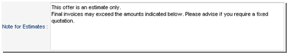
| blurb | Displays the contained markup inside a div with binding substitutionsUnlike other widgets, the blurb is not required to be contained within a form container |
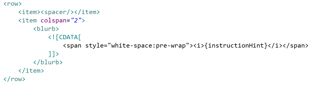 |
All |
| button | Can be placed within the view when the inActionPanel flag for an Action is set to falseIf the Action is declared to be in the Action Panel, then no button widget is required to be declared. |
 |
All |
| checkBox | Tri-state check box (null/true/false) - for a two-state checkBox set the property `triState="false"` |  |
Form |
| checkMembership | Providing for checkbox multiselection | Non-form | |
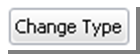
| colourPicker | Displays a text box containing the colour code value together with a sample square of the colour Clicking on the sample square activates a colour selector popup. |
 In this example, the colour button at the RHS will open a colour selector as shown below: In this example, the colour button at the RHS will open a colour selector as shown below: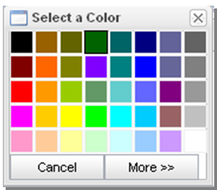 |
Form |
| combo | Drop-down selector for enumerations or where a domain type is specified for the document attribute |  |
Form |
| comparison | Displays the differences between two beans instances and the ability for the users to apply differences between the instances (for an example, see the Audits function in the Skyve admin module) | 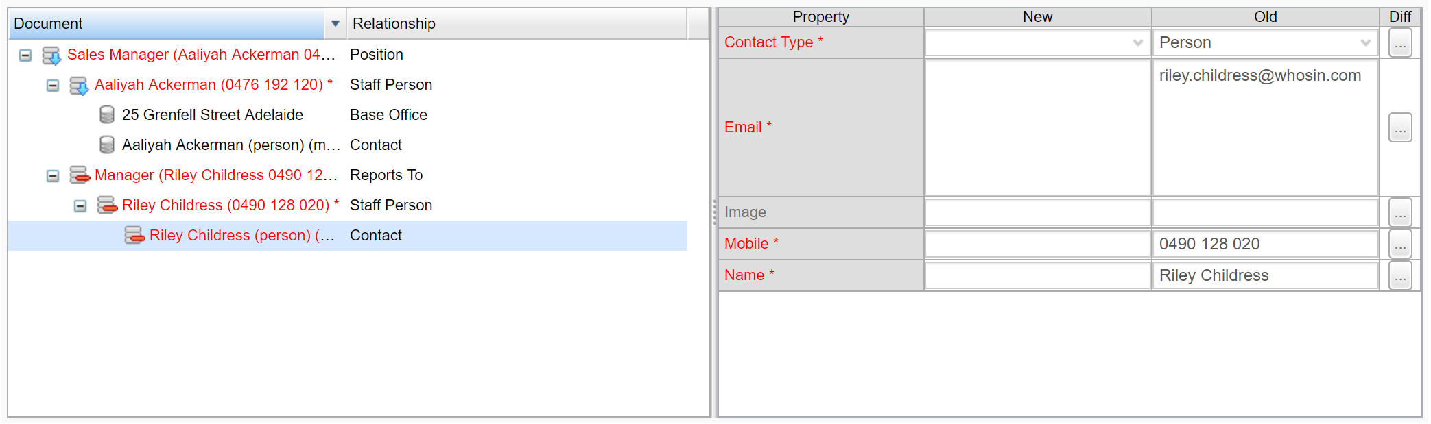 |
Non-form |
| component | A component declares the inclusion of other view declarations, or sections of view declarations, allowing re-use of view declaration | Non-form | |
| contentImage | Displays the loaded image along with an upload action | 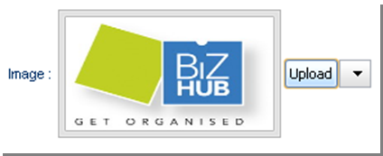 |
Form |
| contentLink | Displays a hyperlink to open the content in a new browers window together with an upload action | 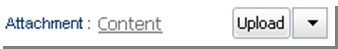 |
Form |
| dataGrid | Provides a grid/table for displaying tabular data a view, e.g. from a collection associated to the current document. | Non-form | |
| dataRepeater | Same as dataGrid, but the borders and headings are not displayed. Useful when combing with markup attributes in the collection for specific display formatting. |
Non-form | |
| default | If used in a view, this will render whatever the default widget is. Either the defaultWidget declared on the document attribute or the Skyve default control for the attribute type. |
Form | |
| dialogButton | Not yet implemented. | All | |
| geoLocator | Geolocator will render a Map button, when pressed, a Geolocation window will appear with a pointer to the address or position bound to the Geolocator widget. A new address or location can be selected within the Geolocator Map if the Geolocator is not disabled. The Geolocator Widget has multiple bindings which interact with the map:
|
When the Map button is clicked, the geolocator (shown) will be displayed in a modal window. 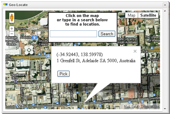 |
All |
| geometry | Displays a Well Known Text (WKT) representation of the geometry, with a map-based selection tool | Form | |
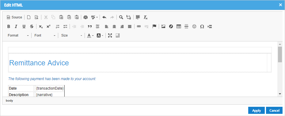
| html | Displays HTML content together with an Edit button (only available for SmartClient renderer) When the edit button is clicked, a popup HTML editor window is displayed allowing users to create rich HTML. |
 |
Form |
| inject | Allows the inclusion of javascript snippets within the view | 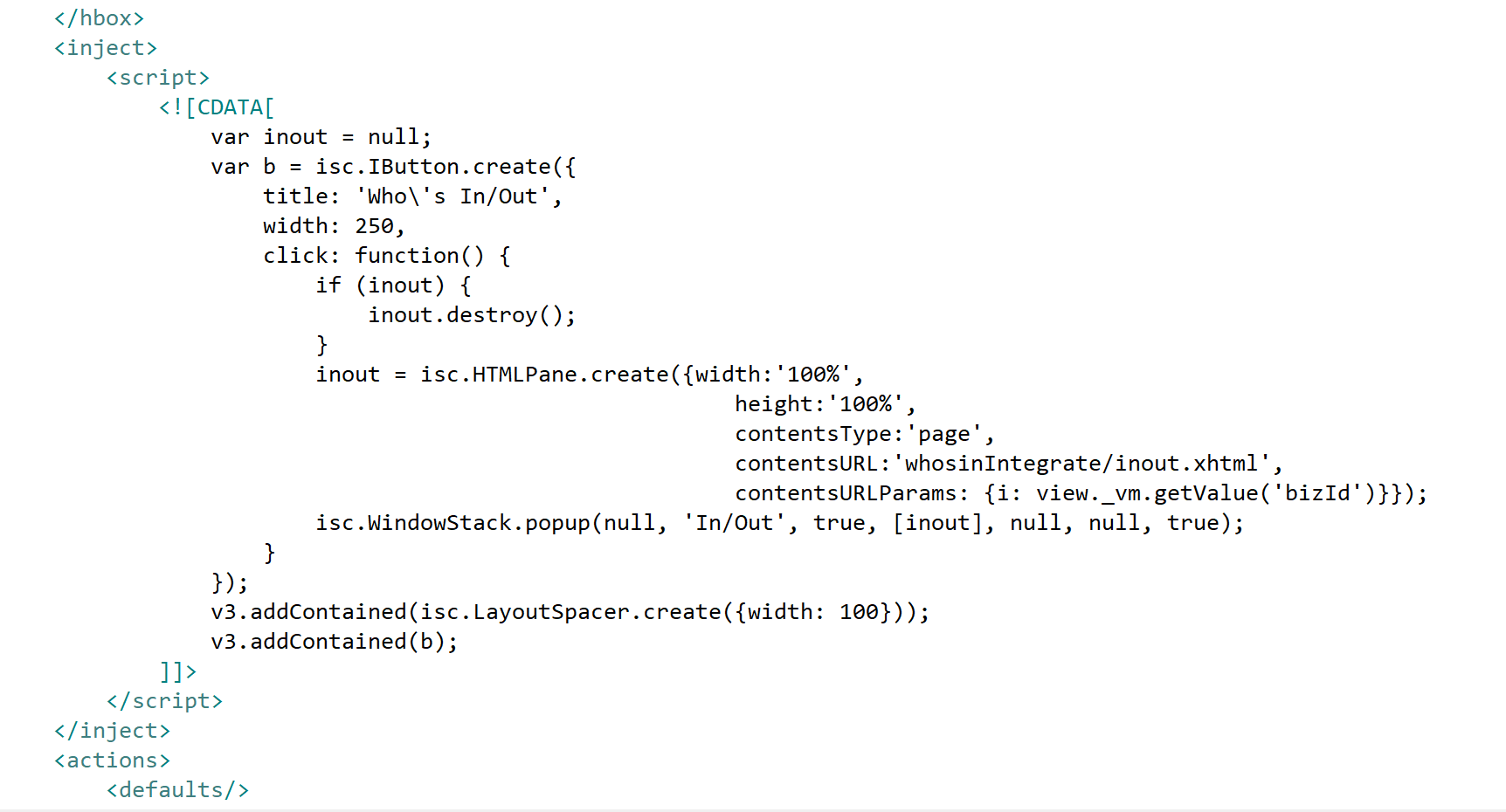 |
Non-form |
| label | Simple text. |  |
All |
| link | Provides a link style approach to Skyve platform features (partially implemented)options include:
|
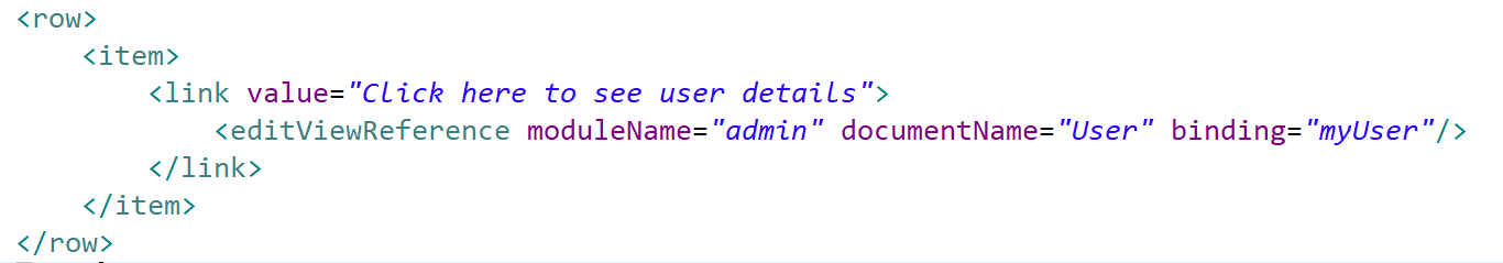 |
All |
| listGrid | List grid component included in a view - the listGrid provides the same functionality as menu lists within the context of a custom view for the management of unrelated or informally-related bean instances | 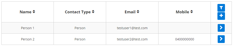 |
Non-form |
| listMembership | List-based multi-selection tool | 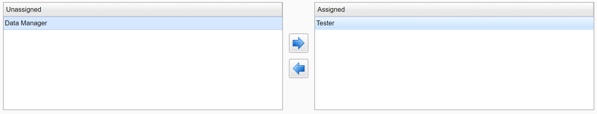 |
Non-form |
| listRepeater | Same as listGrid, but the borders and headings are not displayed. Useful when combing with markup attributes in the list for specific display formatting. |
 |
Non-form |
| lookup | Deprecated. | Form | |
| lookupDescription | lookupDescription is used to display an association to another document, and combines a combo with a pick button. Users may select a value from the combo, or type values into the text box which will locate a matching value in the combo drop-down list if found. When the pick button is pressed, a Pick window containing a listGrid is displayed, showing eligible values as declared in the document association. Whereas normally double-clicking in a grid will zoom into the row, double-clicking in a Pick grid will select that value, close the popup and set the value of the lookupDescription combo next to the Pick button. The down-arrow button reveals options to Edit (i.e. Zoom), New or Clear the reference. More features of the lookupDescription are explained in the next section. |
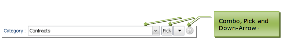 In this example the bizKey of the currently associated document instance is displayed in the control. To use another attribute change the lookupDescription's descriptionBinding attribute. If the Pick button is clicked, a listGrid of eligible document instances is shown in a modal window. 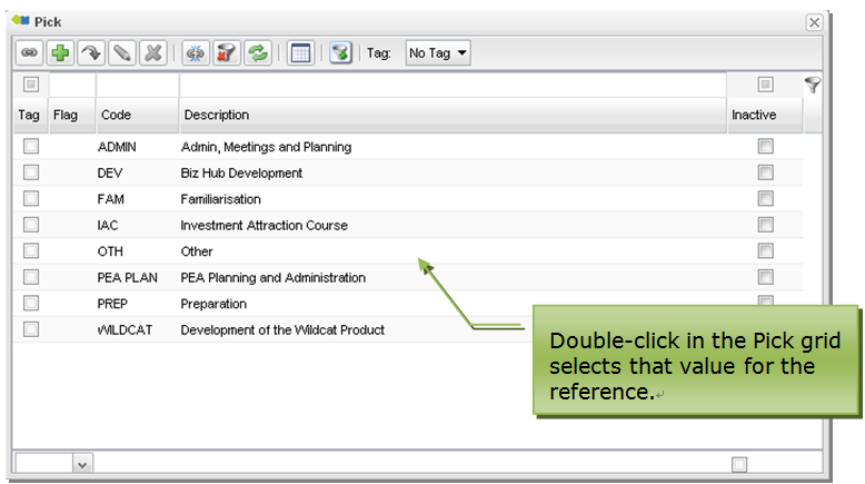 The down-arrow selector button will display options for Edit (edit the referenced document on-the-fly), New (create a new potential reference on-the-fly) and Clear (clear the reference). 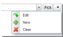 |
Form |
| map | Displays a map centred on the geometry attribute specified in the map's binding. Map controls allow the geometry to be set/updated, which may be a point or a polygon. |
Non-form | |
| password | A textField which obfuscates the entered value |  |
Form |
| progressBar | Not yet implemented. | Non-form | |
| radio | radio selector for enumerations or for document attributes where a domain type is specified Radios may be laid out vertically or horizontally, using the property vertical. Vertical arrangement is the default arrangement for radio selectors when no arrangement is specified. Radios can also be used for boolean attributes. To do this, declare a constant domain for the attribute, and override the `getConstantDomainValues` Bizlet method to return two domain values
|
 |
Form |
| richText | Provides a rich text area together with formatting toolbar. | 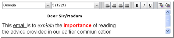 |
Form |
| sidebar | Displays floating content in a separate area of the view which is always present when you scroll. Properties include:
|
 |
Non-form |
| slider | Numeric slider. Properties include:
May be displayed vertically when vertical is set to true.
|
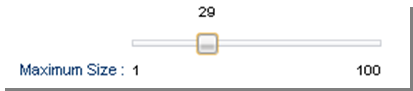 |
Form |
| spacer | A widget provided to fill a column when no other widget is required. Items within rows always fill from the leftmost available column. The spacer widget is provided to allow items to fill from other than the leftmost column. |
The spacer widget displays nothing. | All |
| spinner | Numeric spinner allowing users to either type or select a value using the arrows Properties include:
|
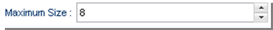 |
Form |
| staticImage | Displays a static image. |  |
All |
| staticLink | Hyperlink to a static URL. Properties:
|
Not yet implemented. | Form |
| textArea | Basic data entry field for long text, textArea provides a wrap property to control whether the contained text is word wrapped. |
 |
Form |
| textField | Provides basic data entry for text attributes textField responds to the type of the bound attribute, and will display converter hint if the value is null.For date and dateTime types, a calendar selector is displayed.Use the _complete_ for auto-complete and type-ahead on previous values or suggestions as the user types (see example below) |
 This example is a textField widget bound to a text type attribute. 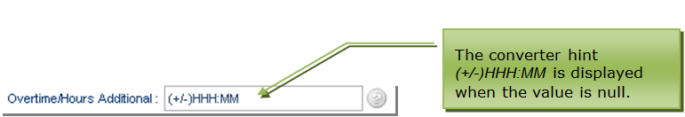 This example is a textField widget bound to a time attribute using the HH_MM converter. 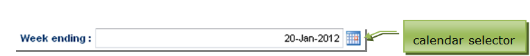 This example is a textField widget bound to a date or dateTime attribute. The calendar tool on the right will either include time or not depending on which of these types the attribute is. |
Form |
| treeGrid | Display and navigate hierarchical structures | 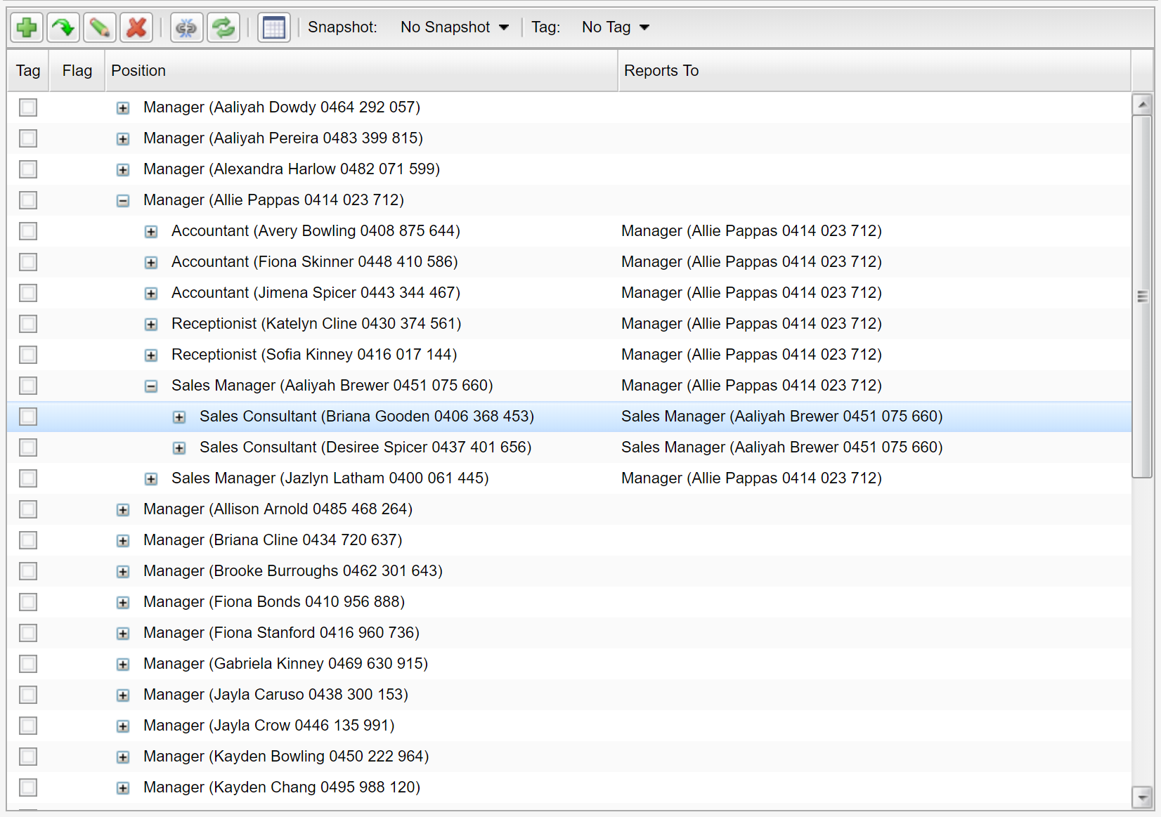 |
Non-form |
Type-ahead and Auto-completion Using complete
The textField widget can be extended to provide suggestions to the user as they type via the complete setting.

Here the textField widget provides the user with suggested completions based on the value they have typed.
To achieve this, declare the complete option in on the textField, and then override the complete method in the bizlet.
<textField binding="suburb" complete="suggest"/>
In this example, the method uses the convenience method ModulesUtil.getCompleteSuggestions() to generate a list of suggestions, however the developer can generate the list of suggestions using bespoke code for their situation.
@Override
public List<String> complete(String attributeName, String value, ControlPanelExtension bean) throws Exception {

	if(ControlPanel.testTagNamePropertyName.equals(attributeName)) {
		return ModulesUtil.getCompleteSuggestions(Tag.MODULE_NAME, Tag.DOCUMENT_NAME, Tag.namePropertyName,value);
	}
	return super.complete(attributeName, value, bean);
}
The complete() method parameters are:
- attributeName - the binding name of the textField widget
- value - the value entered by the user
- bean - the bean which is being edited by the user
There are three options for complete :
- previous - automatically provide a list of distinct previous values for the same binding (e.g. “suburb”) but still allow the user to enter new values not previously used. Previous is a special no-code case (the bizlet “complete()” method is not required to be overridden for this option).
- suggest - provide a list of suggested values from some other list provided by the developer but still allow the user to enter new values not in the suggested list.
- constrain - provide a list of suggested values from some other list provided by the developer and constrain data entry only to those values.
Change event action (client-side events)
User interactions can be customised via the use of change event handlers declared on view widgets. For example, a textField widget provides handlers for blur, change and focus events.
A change handler can be included in a widget declaration as follows:
<textField binding="name">
	<onBlurHandler>
		<server action="recalculate" />
	</onBlurHandler>
</textField>
The above declaration will call the custom recalculate server-side action when the blur event occurs on the textField (i.e. as the focus moves from the textField).
The availability of change event handlers is specific to the type of widget. For example, a blur event is relevant for an input widget, but a remove event is not relevant for a textField.
The following tables shows which change handlers are available for each type of view widget.
| Widget | blur | change | focus | added | cleared | deleted | edited | picked | removed | selected |
|---|---|---|---|---|---|---|---|---|---|---|
| blurb | ||||||||||
| button | ||||||||||
| checkBox | Y | Y | Y | |||||||
| checkMembership | Y | Y | Y | |||||||
| colourPicker | Y | Y | Y | |||||||
| combo | Y | Y | Y | |||||||
| comparison | ||||||||||
| component | ||||||||||
| contentImage | ||||||||||
| contentLink | ||||||||||
| dataGrid | Y | Y | Y | Y | Y | |||||
| dataGridRepeater | ||||||||||
| default | ||||||||||
| dialogButton | ||||||||||
| dynamicImage | ||||||||||
| geoLocator | ||||||||||
| geometry | Y | Y | Y | |||||||
| html | ||||||||||
| inject | ||||||||||
| label | ||||||||||
| link | ||||||||||
| listGrid | Y | Y | Y | |||||||
| listMembership | Y | |||||||||
| listRepeater | ||||||||||
| lookup | Y | Y | Y | Y | ||||||
| lookupDescription | Y | Y | Y | Y | ||||||
| map | ||||||||||
| password | Y | Y | Y | |||||||
| progressBar | ||||||||||
| radio | Y | Y | Y | |||||||
| richText | Y | Y | Y | |||||||
| slider | Y | Y | Y | |||||||
| spacer | ||||||||||
| spinner | Y | Y | Y | |||||||
| staticImage | ||||||||||
| staticLink | ||||||||||
| textField | Y | Y | Y | |||||||
| textArea | Y | Y | Y | |||||||
| treeGrid | Y | Y | Y |
View containers (vbox, hbox, tabPane, form etc) do not provide change handlers.
Multiple event actions can be defined for the single event, and the order of execution will follow the order in which the handlers are declared.
<combo binding="treatmentType">
  <onChangeHandlers>
    <server action="recalculate" />
    <setDisabled disabled="zeroValue" />
    <rerender />
  </onChangeHandlers>
</combo>
Example of multiple onChangeHandlers
Change event actions can be defined for the change of value of widgets defined within a view.
| Event Action | Description |
|---|---|
| rerender | hits the server, reevaluates the UI conditions, but maintains user edits. |
| server | executes a server-side action. |
| setDisabled | sets the widget to disabled based on a condition (SmartClient renderer only) |
| toggleDisabled | checks the state of the widget pointed to by the binding and toggles the disabled state. (SmartClient renderer only) |
| setInvisible | sets the widget to invisible based on a condition. (SmartClient renderer only) |
| toggleInvisible | checks the state of the widget pointed to by the binding and toggles the disabled state. (SmartClient renderer only) |
OnChange Event Actions
List selection and refresh
A common gesture is to select a row in a list as the basis of some action.
To achieve this, set the onSelectedHandler on the widget as shown below.
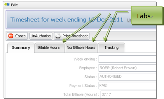
<listGrid query="qTimesheets" selectedIdBinding="selectedTimesheetId" postRefresh="refreshTimesheetList">
	<onSelectedHandlers>
		<server action="TimesheetSelected" />
	</onSelectedHandlers>
</listGrid>
The selectedIdBinding is the binding name of a document attribute that holds the bizId of the selected row - so that you can use the result of the selection gesture in server-side code.
In this case, the document would include an attribute declared as follows:
<id name="selectedTimesheetId" persistent="false" trackChanges="false">
	<displayName>Selected Timesheet</displayName>
</id>
Typically the result of the user selection is not persisted (persistent="false") and the bean would not normally be considered to be dirty because of the selection (trackChanges="false").
The result of the selection can then be used in server-side code as a normal bean attribute:
	//retrieve the timesheet selected in the list by the ser
	Timesheet t = CORE.getPersistence().retrieve(Timesheet.MODULE_NAME
		, Timesheet.DOCUMENT_NAME
		, bean.getSelectedTimesheetId()
		, false);

	//do some processing with the selected timesheet t
	...
Lists are refreshed lazily and only when they are accessible to the user. For example, if a listGrid is on a tab which is not currently selected, the listGrid will not be refreshed until the tab is active. However, lists will be refreshed after server-side activity, and so developers need to consider the impact using the selected event may have.
postRefresh allows you to specify refreshing of the list conditionally - to guard against situations where the results of the onSelectedHandler causes a continuous list refresh.
Note that with postRefresh="false", the list will still be refreshed the first time it is made available to the user, so that an empty list isn’t returned.
Also note that lists will be refreshed if the list is accessible by the user from scrolling - so if the list is outside of the area currently visible but still on the active part of the view, the list will be triggered for refresh unless controlled by a postRefresh condition.
Update property
The update property (PrimeFaces renderer only) implements the PrimeFaces update property - which allows developers to limit rerendering to a specified container. This prevents the page from being completely rerendered when a change occurs in a widget, leading to a better user experience and better performance on larger pages.
Before using the c:property, ensure that your view element definition includes the XML common namespace (xmlns:c="http://www.skyve.org/xml/common") as shown below:
<view name="edit" title="<view title>"
	xsi:schemaLocation="http://www.skyve.org/xml/view ../../../../schemas/view.xsd"
	xmlns="http://www.skyve.org/xml/view"
	xmlns:c="http://www.skyve.org/xml/common"
	xmlns:xsi="http://www.w3.org/2001/XMLSchema-instance">

In the above example, only the container with a widgetId of citizenship will be rerendered when the value of the combo is changed.
Scrolling
For the PrimeFaces renderer only - all template.xhtml pages have head and body ids. This allows controlled scrolling for PrimeFaces views as well as to any widgetId added by the developer. This can be useful for large views where the developer wants to focus the user attention on a particular area.
PrimeFaces.current().scrollTo("head");
PrimeFaces.current().scrollTo("body");
PrimeFaces.current().scrollTo("widgetId");
The lookupDescription widget in detail
The lookupDescription widget is unique to Skyve and provides comprehensive ability to display and select document references.
| Property | Description |
|---|---|
| binding | The association attribute to which the widget is bound. |
| descriptionBinding | The binding in the associated document which will be displayed in the text box when an reference is selected. In most cases, the descriptionBinding will be set to the bizKey attribute of the reference, which defines a short text representation of the entire document being referenced. bizKey is always available for query based widgets and does not need to be declared as a column within the query definition. |
| disabled | Controls whether all aspects of the widget are disabled. |
| disableAdd | Controls whether the Add function (New) is disabled (allowing on-the-fly creation of the foreign reference). |
| disableClear | Controls whether the Clear function is disable (clearing the reference). |
| disableEdit | Controls whether the Edit function is disabled (allowing on-the-fly editing of the foreign reference). |
| disablePick | Controls whether the Pick list is accessible. |
| invisible | Controls whether the entire widget is invisible. |
| pixelWidth | Width of the text box component in pixels. |
| query | By default, a lookupDescription will use the defaultQuery for the document specified in the association attribute declaration for both the combo/drop-down and pick list. If the association nominates a metadata query then this query will be used. If the widget nominates a query in this attribute, this query will be used. Note that bizKey is always available for queries and does not need to be declared as a column in the query. |
Properties of the lookupDescription

Multi-column drop-down/combo lookupDescription
By default the lookupDescription will display only the bizKey for each row returned by the effective query in the drop-down. However, lookupDescription can alternatively nominate a subset of query columns for display in the drop-down.
<lookupDescription binding="bankAccount" descriptionBinding="bizKey" query="docQueryBankAccount" >
    <filterParameter operator="equal" filterBinding="active" value="true"/>
    <dropDown>
        <column>bsb.bsb</column>
        <column>accountNumber</column>
    </dropDown>
</lookupDescription>
Multi-column drop-down lookupDescription
Filter parameters for lookupDescription
Filter parameters can be applied to the lookupDescription widget, which will apply additional filtering (over and above any filtering defined in the applicable query). Filter parameters can be value (for a static value) or binding (filtering the list of eligible references by the value of a binding from the document being viewed).
<lookupDescription binding="contact" descriptionBinding="bizKey" disabled="notManager">
  <filterParameter filterBinding="contactType" value="Person" />
</lookupDescription>
Filter parameters for lookupDescription
If filterParameters have been defined and the user creates a reference on-the-fly (using the Add/New action), the created document will have the filterParameter values set by default.
<row>
  <item>
    <lookupDescription binding="codeListAllocationCode" descriptionBinding="bizKey">
      <filterParameter filterBinding="codeListSchemeCode" valueBinding="parent.codeListSchemeRound.codeListSchemeCode" />
    </lookupDescription>
  </item>
</row>
Example lookupDescription with filterParameter
In the above example, the lookupDescription for binding codeListAllocationCode has a filterParameter using the current document binding of parent.codeListSchemeRound.codeListSchemeCode used as the filtering value on the column named codeListSchemeCode in the related data set or query (using the name of the reference implies the use of the bizId field).
If the user opts to create a new codeListAllocationCode reference, then the attribute called codeListSchemeCode in the new codeListAllocationCode instance will be set to the value of parent.codeListSchemeRound.codeListSchemeCode.
Note that any number of filterParameters can be declared.
OnChange handlers for lookupDescription
Rather than a generic OnChange action event, the lookupDescription provides the ability to define actions for each type of event which the widget supports.
The available event handlers are:
- onAddedHandlers,
- onClearedHandlers,
- onEditedHandlers, and
- onPickedHandlers.
<lookupDescription binding="contact" descriptionBinding="bizKey" disabled="notManager">
  <onAddedHandlers>
    <server action="applyRules" />
  </onAddedHandlers>
  <filterParameter filterBinding="contactType" value="Person" />
</lookupDescription>
The onAddedHandler event action
In the above example, if the user sets a reference by creating a document on-the-fly, the server-side action applyRules will be executed after the Add action is completed.
The action events available are the same as for all other event actions as described in Table 14. As with all OnChanged handlers, multiple event actions can be executed for the same event.
dataGrid
A dataGrid displays members of a collection.
The dataGrid widget has the following properties.
| Property | Description |
|---|---|
| binding | the collection to which the grid is bound |
| disabled | an overall control disabling all aspects of the grid This setting overrides all other settings if disabled = true. |
| disableAdd | disables the ability to add members to the collection (add button and context Add are disabled) |
| disableEdit | disables the ability to edit within the grid (edit button and context Edit) |
| disableRemove | disables the ability to remove members from the collection (remove button and context Remove are disabled) |
| disableZoom | disables the ability to zoom into the member |
| editable | removes all access to the grid toolbar |
| enableAdd | enables the ability to add members to the collection (add button and context Add are disabled) |
| enableEdit | enables the ability to edit within the grid (edit button and context Edit) |
| enableRemove | enables the ability to remove members from the collection (remove button and context Remove are disabled) |
| enableZoom | enables the ability to zoom into the member |
| inline | allows editing of the grid row in-line rather than by zooming into the member’s edit view |
| invisible | hides the grid |
| maxPixelHeight, maxPixelWidth, minPixelHeight, minPixelWidth | control the maximum and minimum height and width of the grid in pixels |
| percentageHeight, percentageWidth | height and Width in terms of percentage of available space |
| pixelHeight, pixelWidth | height and Width in terms of pixels |
| responsiveWidth | control the width of the grid using the responsive layout concept |
| selectedIdBinding | if a selectedIdBinding is provided, the attribute will hold the Id of the selected row - this enables user interactions based on which row is selected |
| showAdd | show or hide the Add (i.e. new child row) control |
| showDeselect | show or hide the Deselect row control |
| showEdit | show or hide the Edit contol (for inline row editing) |
| showRemove | show or hide the Remove control (for removing a child row) |
| showZoom | show or hide the Zoom control |
| title | the title of the grid |
| visible | whether to show or hide the grid |
| widgetId | an identifier for the grid - a way to uniquely identify the grid component |
| wrap | default setting for contained widgets which controls whether the display of text should wrap (expanding row sizes) or whether text should truncate (so that only text which fits in the column width is displayed) |
dataGrid properties
By default, the dataGrid widget displays with an action tool bar relevant for managing the collection. datagrids support drag-drop for ordering, provided this is allowed as per the declaration of the collection.

Columns
Grid columns are bound to attributes of the collection member document - the document specified in the declaration of the collection. If no input widget is declared the column will use the default widget for the attribute, or the default widget for the attribute type.
dataGrid provides two types of columns containers:
- boundColumn
- containerColumn
A boundColumn is a column for a binding and the boundColumn properties include:
| Property | Description |
|---|---|
| alignment | whether the column is aligned left, centre or right |
| binding | document attribute to which the column is bound |
| editable | controls whether the attribute is editable within the dataGrid |
| pixelWidth | width of the column in pixels |
| title | a column title to use instead of the attribute’s displayName |
dataGrid boundColumn properties
A containerColumn provides more control over the widget type contained in the column and properties include:
| Property | Description |
|---|---|
| alignment | whether the column is aligned left, centre or right |
| pixelWidth | width of the column in pixels |
| title | a column title to use instead of the attribute’s displayName |
dataGrid containerColumn properties
A containerColumn can contain the following widgets:
- blurb
- contentImage
- dynamicImage
- label
- link
- staticImage
The widget declared in the containerColumn controls the input widget when the value is edited, in preference to the default widget.
Event handlers for dataGrid
The dataGrid widget offers the following event handlers:
- onAddedHandler - what events to perform after a new row is added to the grid
- onEditedHandler - what events to perform after a row is edited
- onRemovedHandler - what events to perform after a row is removed/deleted
- onSelectedHandler - what events to perform after a row is selected
dataGrid Example
For a dataGrid, there must be a collection of the document you want to show inside the document you want to show them from.
<collection type="aggregation" name="example">
	<displayName>Example</displayName>
	<documentName>Example</documentName>
	<minCardinality>0</minCardinality>
</collection>
Once your collection is in, you can add in the dataGrid and it’s columns into your edit view:
<dataGrid binding="example">
	<boundColumn binding="textExample"/>
	<boundColumn binding="dateExample"/>
</dataGrid>
The dataGrid binding is the document you wish to display from, and the boundColumns are the fields from your chosen document that you wish to show:

listGrid
Views may also contain an embedded listGrid which is identical to the main list feature.
A listGrid can be used for showing collections of document instances and can be used to show loosely defined relationships, for example, if the Contact view was required to include a list of other Contacts with the same Post Code (even though no formal relationship to a Post Code document is implemented).

| Property | Description |
|---|---|
| autoPopulate | whether or not the list results will be populated as soon as the list is due to be rendered - if autoPopulate is set to “false”, the list will not populate results until filter criteria have been provided and the filter control is actioned |
| disableAdd | disables the ability to add members to the collection (i.e. the Add button and context menu item Add are disabled) |
| disabled | an overall control disabling all aspects of the grid |
| disableEdit | disables the ability to edit within the grid (i.e. the Edit button and context menu item Edit) |
| disableRemove | disables the ability to remove members from the collection (i.e. the Remove button and context menu item Remove are disabled) |
| disableZoom | disables the ability to zoom into the member |
| continueConversation | whether events occurring within the scope of the listGrid activity are to be handled within the same transaction as events on the bean on which the view, containing the listGrid, is based |
| enableAdd | enables the ability to add members to the collection (i.e. the Add button and context menu item Add are enabled) |
| enabled | an overall control enabling all aspects of the grid |
| enableEdit | enables the ability to edit within the grid (i.e. the Edit button and context menu item Edit) |
| enableRemove | enables the ability to remove members from the collection (i.e. the Remove button and context menu item Remove are enabled) |
| enableZoom | enables the ability to zoom into the member |
| invisible | hides the grid |
| maxPixelHeight, maxPixelWidth, minPixelHeight, minPixelWidth | the maximum and minimum height and width of the list in pixels |
| model | the list model on which the rows of the list are populated |
| percentageHeight, percentageWidth | height and width in terms of percentage of available space |
| pixelHeight, pixelWidth | height and width in terms of pixels |
| postRefresh | whether the list is automatically repopulated after the rerender event |
| query | the query defining the results displayed in the grid. Unlike lookupDescriptions, which can use default document queries, listGrid must have a query nominated (and therefore declared in the module.xml) |
| responsiveWidth | the width of the list according the responsive layout concept |
| selectedIdBinding | if a selectedIdBinding is provided, the attribute will hold the Id of the selected row - this enables user interactions based on which row is selected |
| showAdd | whether to show or hide the Add (new instance) control |
| showDeselect | whether to show or hide the Deselect row control |
| showEdit | whether to show or hide the Edit control |
| showExport | whether to show or hide the Export control |
| showFilter | whether to show or hide the Filter controls (both simple and advanced filter controls) |
| showRemove | whether to show or hide the Remove (row delete) control |
| showSnap | whether to show or hide the Snapshot control |
| showSummary | whether to show or hide the Summary control |
| showTag | whether to show or hide the Tag control |
| showZoom | whether to show or hide the Zoom (zoom into a row) control |
| title | the title of the listGrid (displayed above the listGrid) |
| visible | whether or not the listGrid is visible |
listGrid properties
Where a query is declared, the ability to edit individual column values will be as declared by the query unless the grid is disabled or editing is disabled using the disableEdit property.
Where continueConversation is set to “false”, listGrid events will not be managed within the same transaction as other events in the view.
For example, if a user zooms into a row of a listGrid the edit view zoomed to will display OK and Save actions by default (unless the edit view declares otherwise). Changes to the zoomed to document will be in a separate transaction to any activity on the document in the view where the listGrid is located.
Where a model is declared, population of list rows is handled by the model code. List models support paging, summaries and filtering , where filter controls can manipulate predicates to impact on the list results.
Filter parameters for listGrid
Filter parameters can be applied to the listGrid widget which will apply additional filtering (over and above any filtering defined in the applicable query).
Filter parameters can be by value (for a static value) or by a valueBinding
(filtering the list of eligible references by the value of a binding
from the document being viewed).
If filterParameters have been defined and the user creates a new document from the grid (using the grid Add action), the created document will have the filterParameter values set by default.
<vbox border="true" borderTitle="Communications using this template">
	<listGrid query="qCommunications" continueConversation="true">
		<filterParameter operator="equal" filterBinding="template" valueBinding="bizId" />
	</listGrid>
</vbox>
In the example shown above, the listGrid in the CommunicationTemplate edit view refers to a query in
the admin module, qCommunications, which when unfiltered returns all Communication records. By applying
a filterParameter on the template binding, only Communications using the current template will be displayed.
The filterParameter valueBinding ‘bizId’ refers to the binding in
the current document view which provides the value for the filter (in
this case bizId). Note that the binding does not need to be included
in the view declaration to be able to be used for a filterParameter.
Event handlers for listGrid
The listGrid widget offers the following event handlers:
- onDeletedHandler - what events to perform after a row is deleted
- onEditedHandler - what events to perform after a row is edited
- onSelectedHandler - what events to perform after a row is selected
listGrid Example
You can add in the listGrid into your edit view as such (the columns shown in the listGrid are decided by the fields shown in the query):
<listGrid continueConversation="true" query="qContacts"/>
The listGrid query attribute is the query you wish to display. The columns
displayed in the listGrid are decided by the fields specified in the query. If
you wish to change the columns displayed, update the query in the module.xml.
listMembership
The listMembership widget is used when a user should be able to quickly multi-select many options from a collection of available options and assign them to a record. It provides intuitive add one, add all, remove one, and remove all controls for managing memberships in a list.
This widget is typically used for aggregated many-to-many style relationships, such as assigning permission groups to users. This would not be used for owned collections (child or composition).
See the groups collection in the User document in the admin module for a working example.
How it works
The widget binds to a collection in the document, representing the selected records (right-hand side).
The list of available records (left-hand side) is automatically populated from all available instances of the target document, using the default query defined for that document. If no default query is specified, all persisted instances of the document are used.
The left-hand side is therefore calculated as:
All candidates minus the currently selected members
You do not need to specify a domain to use listMembership. However, if you want to refine the list of candidates shown on the left-hand side (e.g. only active users), you can set domain="variant" or domain="dynamic" on the collection, and then override the appropriate method (getVariantDomainValues() or getDynamicDomainValues()) in the document’s Bizlet.
Each side of the listMembership is a single-column list that shows the bizKey of each record.
Example Usage
In this example, we create a listMembership widget to manage a collection of users who will receive email reminders.
document.xml
Define a persistent collection which will store the selected members:
<collection name="subscribers" type="aggregation">
   <displayName>Reminder Subscribers</displayName>
   <description>Users in this group will receive reminder email notifications.</description>
   <domain>dynamic</domain> <!-- optional; required only if refining the available list -->
   <documentName>UserProxy</documentName>
   <minCardinality>0</minCardinality>
</collection>
edit.xml
Add the listMembership widget to the view and specify the binding of the collection. The candidatesHeading and membersHeading attributes are optional, but they help to clarify the purpose of each list, where the left-hand side is the list of available users and the right-hand side is the list of selected subscribers.
<listMembership binding="subscribers" candidatesHeading="All Active Users" membersHeading="Subscribers" />
In this example:
bindingspecifies the attribute (collection) to bind to.candidatesHeadingis the label shown above the list of available records.membersHeadingis the label shown above the list of selected members.
Bizlet (dynamic domain population)
Override getDynamicDomainValues() in your Bizlet to provide the list of available records (this should include the selected values too):
@Override
public List<DomainValue> getDynamicDomainValues(String attributeName, DocumentName bean) throws Exception {
	if (DocumentName.subscribersPropertyName.equals(attributeName)) {
		// only return active users to be available for selection
		DocumentQuery q = CORE.getPersistence().newDocumentQuery(User.MODULE_NAME, User.DOCUMENT_NAME);
		q.getFilter().addNotEquals(User.inactivePropertyName, Boolean.TRUE);
		q.addBoundOrdering(Bean.BIZ_KEY);
		List<UserExtension> activeUsers = q.beanResults();

		return activeUsers;
	}
	return super.getDynamicDomainValues(attributeName, bean);
}
Important: This list must include the currently selected records as well, otherwise Skyve will not be able to resolve the display values of the selected records in the collection in the UI when the bean is rehydrated. Any records in the collection will still be saved, but will display as a list of bizIds instead of their bizKey.
newParameter
The newParameter section enables the context of one view to be passed to another view, when new documents are being created.
For example, if a view contains a listGrid which is filtered for Contacts of type Person and the user adds a row to the listGrid in that context, the fact that this new row implicitly belongs to a filtered set needs to be passed, and so the Person type value should be set by default in the new Contact. (It would be unexpected for example, to add a new row to a list of Person type Contacts which is not a Person type Contact.)
For parameters to be passed in this way, the newParameters named in the target view must match the names of the filterParameters being passed.
The name of each newParameter in the target view matches a binding in the document of the target view. The binding does not need to be present in the target view definition, but it must be a valid binding in the target document.
<newParameters>
  <parameter fromBinding="model" boundTo="model"/>
  <parameter fromBinding="type" boundTo="type"/>
</newParameters>
Action declaration
The action section of the view declares which actions will be available to the user and under what conditions.
Typically, scaffolded views contain the
Skyve will automatically hide actions that are not appropriate for the user or situation (for example, if the new action is declared, but a user’s privileges do not include the create privilege for the relevant document).
Note that action buttons can be located either in the ActionPanel or using the <button> widget within a view form, however the action itself must be declared
in the <actions> section of the view.
Tip: You must declare all actions in the action section even if they will not appear in the ActionPanel.
Report actions (described below) provide access to defined report objects (for example Jasper reports) and must also be declared in the actions section of the view.

The following table lists the properties for each action declaration.
| Property | Description |
|---|---|
| className | the name of the Java action class to be executed when the button is pressed |
| clientValidation | whether or not to perform validation in the client, prior to (i.e. to determine whether) the action should be allowed to be performed - if clientValidation is set to “false” the the action will be permitted whether “required” or other validation types may not yet be met |
| confirm | a confirmation message to be displayed requesting confirmation by the user If no confirmation message is supplied, no confirmation is requested. |
| disabled | whether the button is shown in a disabled state |
| displayName | the text which will appear on the button |
| inActionPanel | controls whether the action button is included in the Action Panel at the top of the view If a button is not to be displayed in the ActionPanel a button widget will be required elsewhere within the view for the action to be accessible. |
| iconStyleClass | the icon class to use as the icon for the action using the fontawesom icon style classes - note that special action types (ok, save, delete, cancel, zoomOut, remove, download, upload, import, export) have predetermined icons - e.g. “fa fa-file-photo-o” will use the fontawesome (“fa”) style class “fa-file-photo-o” |
| invisible | whether the action button is invisible |
| relativeIconFileName | the filename of an icon which will be displayed together with the displayName on the button Filenames are usually relative allowing the Skyve overriding mechanism to locate the absolute path to the file based on the context of the user. |
| name | where multiple actions may refer to the same action but with different options, the name property distinguishes which property set declaration to use (for example, to send different parameters to the same report) |
| toolTip | tooltip help to be displayed for the button |
| visible | whether the action button is visible |

The above example shows implicit actions are included using the
the <defaults> action set and the <cancel> action,
but with mutually exclusive conditions. Numerous Custom actions are
declared as well as a report action.
For more details see Actions.
Declaring report actions
Report actions declared in a view must reference valid reports (*.jrxml files) and are a special case of actions.
Report actions declarations can include parameters passed to the report engine (see the above example).
Report parameter declarations can be in terms of bindings (within the currently viewed document) or static values. Report parameters are matched using the name attribute with parameters declared in the report.
<report reportName="PaySheet" moduleName="time" documentName="PaySheet" displayName="Print PaySheet" visible="saved">
	<parameter name="ID" valueBinding="bizId" />
</report>
In addition to the generic action properties, Report actions must include a moduleName and documentName attributes to specify the location of the report template file relative to the module.document package.
Report actions are not declared within role definitions in the module.xml.
View components
Skyve allows for reuse of view sections via the component widget.
The view component must be declared according to the convention, with the file name matching the declared name. The component widget then refers to that name, with the addition of a module and document (if the referenced component declaration resides in another document package).

In the above example, a complex view declaration has been broken up into sections - with each section defined as a component - allowing flexible re-use of the view sections.
A view declaration edit.xml may include multiple components and mix these with specific widgets and layouts as appropriate.
<tabPane>
	<tab title="Details">
		<component name="_details" />
	</tab>
	<tab title="Interactions">
		<component name="_interactions" />
	</tab>
	<tab title="Processes">
		<component name="_processes" />
	</tab>
	<tab title="Seafood">
		<hbox>
			<vbox>
				<map modelName="HarvestAreaMapModel" />
			</vbox>
			<component name="_seafood" />
		</hbox>
	</tab>
</tabPane>
In the above example, the view declaration includes components on each of the tabs, with the final tab mixing a component and a map widgets.
The component has the following attributes:
| Attribute | Description |
|---|---|
| binding | the binding name of the association attribute which corresponds to the driving document of the component - see the association example below for more details. |
| document | the document package where the referenced component declaration resides - it is not necessary to specify the document attribute here if the component resides within the same document |
| invisible | whether the component is invisible |
| module | the module package where the referenced component declaration resides - it is not necessary to specify the module attribute here if the component resides within the same module |
| name | the name of the component declaration being referenced |
| visible | whether the component is visible |
| widgetId | a specific id for the widget so that the widget can be directly referenced (e.g. xhtml) |
Using a component for an associated document
Consider the example where the Contact document has more than one association to the Address document - for homeAddress and workAddress - the component concept provides an alternative to the default Skyve approach of the lookupDescription and Zoom navigation.
In this case, the view declaration for the Address document can be re-used within the Contact view.
<vbox border="true" borderTitle="Home Address">
	<component binding="homeAddress"/>
</vbox>
<vbox border="true" borderTitle="Work Address">
	<component binding="workAddress"/>
</vbox>
In the above declaration, the component binding specifies the association attribute to which the included component will be bound.
Note that in this case, it is not necessary to specify the module and document since these are inferred from the declaration of the association attributes.
The alternative approach is to use widgets with compound bindings similar to the following:
<form border="true" borderTitle="Home Address">
	<column/>
	<column/>
	<row>
		<item>
			<default binding="homeAddress.streetAddress"/>
		</item>
	</row>
	<row>
		<item>
			<default binding="homeAddress.suburb"/>
		</item>
	</row>
	<row>
		<item>
			<default binding="homeAddress.postCode"/>
		</item>
	</row>
</form>
<form border="true" borderTitle="Work Address">
	<column/>
	<column/>
	<row>
		<item>
			<default binding="workAddress.streetAddress"/>
		</item>
	</row>
	<row>
		<item>
			<default binding="workAddress.suburb"/>
		</item>
	</row>
	<row>
		<item>
			<default binding="workAddress.postCode"/>
		</item>
	</row>
</form>
Not only is the component approach more succinct, but it also means that if the Address document is alterered or refactored, view layout changes can be managed in a single authoritative location.
Component substitution
A view component can be used in another document even where the component refers to conditions or other aspects which are specific to one particular document.
The component widget may declare a number of name mappings. These specify the mapping of names from the original document to the document in which the component is used.
Name mappings can be used to substitute:
- condition names
- server action names
- selectedIdBinding names
Consider an example where the Address document declares a condition called showCountry and this is used in the Address view to control visibility of a country attribute. In this case, the Contact document view using the Address view component may not have that condition declared, or may have a different condition to satisfy the same basic requirement.
To map conditions from the source document to the document using the component, specify the names as follows:
<component binding="homeAddress">
	<names>
		<name fromComponent="showCountry" mappedTo="foreignSupplier"/>
	</names>
</component>
In the above example, the value of the foreignSupplier condition from the Contact document will be mapped to where ever the name showCountry exists in the original view declaration (in the Address document package).
Similarly, the names substitution may be required where the view component declares an action - in this case, the action would be declared within the document package where the component is declared (i.e. with the path to the action class being inferred by the convention of being located in the same document package).
If the component is then used in the view of another document, it is necessary to map the action name to an action declared in the document package where the component is used.
View tags (see Routing)
JSF (xhtml) pages can take advantage of Skyve view declarations through view tags. The view tag can render whole views, or portions of views as identified by a widgetId.
For more information see Routing.
Create views
In some situations, the way a document instance is created requires a different view declaration to normal editing - for example, if there is a wizard or stepped approach to creating the instance.
This situation can be handled in a variety of ways, however Skyve also supports the declaration of a view specific to the creation stage.
An example of a create view can be found in the Skyve admin module for the User document. As displayed above, the User document has a create.xml view declared as well as a general edit.xml. In this case, a create view is useful because creating a new User involves several steps not normally required for simple data entry. Compare this with the admin.Contact document - where the basic edit view is sufficient for creating new Contacts and a create view is not required.
Whether the create.xml view is served by Skyve depends on the existence of a condition named created being declared in the corresponding document.xml.
For the above example, the create view will not be served unless the User document includes the created condition similar to the following:
<condition name="created">
	<description>Created</description>
	<expression>
		<![CDATA[isPersisted()]]>
	</expression>
</condition>
In the simple case, the condition uses the isPersisted() method - as a bean is considered to have been created once it has been persisted , however the specific logic can be determined by the developer as required.
Skyve Renderer Comparison
Skyve features the ability to dynamically change the rendering engine based on criteria specified as part of its routing. By default, it switches renderer based on the user agent of the browser. If it detects the user is using a desktop browser, the desktop renderer (SmartClient) will be used, otherwise the responsive renderer (PrimeFaces) will be used.
The table below shows the available renderers in Skyve and their level of completion.
Note: Flutter is the planned renderer for native mobile applications but is still in early stages of development and not available for use in applications yet. JQuery Mobile is the legacy renderer for mobile, PrimeFaces responsive renderer is now used instead. This table is not a complete list.
High Level Features
| Feature | SmartClient | PrimeFaces | Flutter | Description |
|---|---|---|---|---|
| Session management | Y | Y | Ability to create, associate, expire and propagate a user session and prompt for login | |
| Conversation management | Y | Y | Ability to start, associate, propagate and reclaim conversation states in Skyve views | |
| Zooming management | Y | Y | Ability to manage n level zooming across the domain’s aggregations, within and outside of view conversations | |
| Security management | Y | Y | Y | Guarding against XSS, injection attacks and applying best practice network and application security through sanitisation, escaping etc |
| Permission management | Y | P | Ability for the view to react automatically to the user permissions by showing, hiding and altering different view mechanisms | |
| Scope management | Y | Y | Ensuring that view elements issue correct data retrievals based on the current user scope settings | |
| Request management | Y | Y | Ensure requests are issued asynchronously and synchronously as required, orchestrating multiple requests, and managing long running and unresponsive requests | |
| UI Dirty management | Y | Ability to detect data changes in the UI widgets through all request/responses in a conversation and warn when a user is about to perform a gesture that will discard their unsaved changes | ||
| Routing Management | Y | Y | Ability to inject front end markup/logic into existing Skyve views through ‘native’ mechanisms and remain integrated with the Skyve view plus the ability to hijack a view completely through the Skyve routing mechanism and generate pieces of the defined Skyve views as an assembly strategy if appropriate. | |
| View Layout | Y | Y | ||
| Data Grid | Y | Y | Y | |
| Sidebar | Y | Y | Allows floating content to be defined in the view which is always present as you scroll. Pixel breakpoints can be specified at which it automatically collapses on smaller screen widths. The width of the sidebar when open can also be defined. | |
| File Upload | Y | Y | ||
| Content Upload | Y | Y | ||
| File Download | Y | Y | ||
| Image Markup | Y | Y | Provides the ability to draw on top of an uploaded or existing content image. |
View Controls
| Feature | SmartClient | PrimeFaces | Flutter |
|---|---|---|---|
| label | Y | Y | Y |
| blurb | Y | Y | |
| button | Y | Y | |
| checkBox | Y | Y | |
| colourPicker | Y | ||
| Content picker | Y | Y | |
| Date picker | Y | Y | |
| Date/time picker | Y | Y | |
| Drop-down list | Y | Y | |
| geolocator | Y | Y | |
| geometry | Y | Y | |
| inject | Y | ||
| spinner | Y | Y | |
| listMembership | Y | Y | |
| password | Y | Y | |
| richText | Y | Y | |
| radio | Y | Y | |
| slider | Y | Y | |
| spacer | Y | Y | |
| textArea | Y | Y | |
| textField | Y | Y | |
| type-ahead | Y | Y |
List Grids
| Feature | SmartClient | PrimeFaces | Flutter |
|---|---|---|---|
| List Grid | Y | Y | Y |
| Image Thumbnails | Y | Y | |
| File Thumbnails | Y | Y | |
| Column filtering | Y | Y | Y |
| Column sorting | Y | Y | Y |
| Advanced filtering | Y | ||
| Export | Y | ||
| Open in new tab | Y | Y |
Desktop only features
The following features are only available for the SmartClient renderer, as they do not provide a good end user experience to try to implement on a touch device or low resolution screen.
- Prompt on expired session
- Global content search
- List Grid features
- Advanced filtering
- Map based filtering
- Tagging
- Snapshots
- Flags
- Exporting